Understanding the Builder Interface
The Formcierge builder has several distinct areas and panels — once you understand what each one does, building complex forms becomes much faster. This tutorial gives you a guided tour of the entire interface: the top bar, the left panel (field palette and styles), the canvas where you arrange fields, the right panel (field settings), the settings modal, and the preview flow. You do not need to build a complete form — the goal is familiarity.
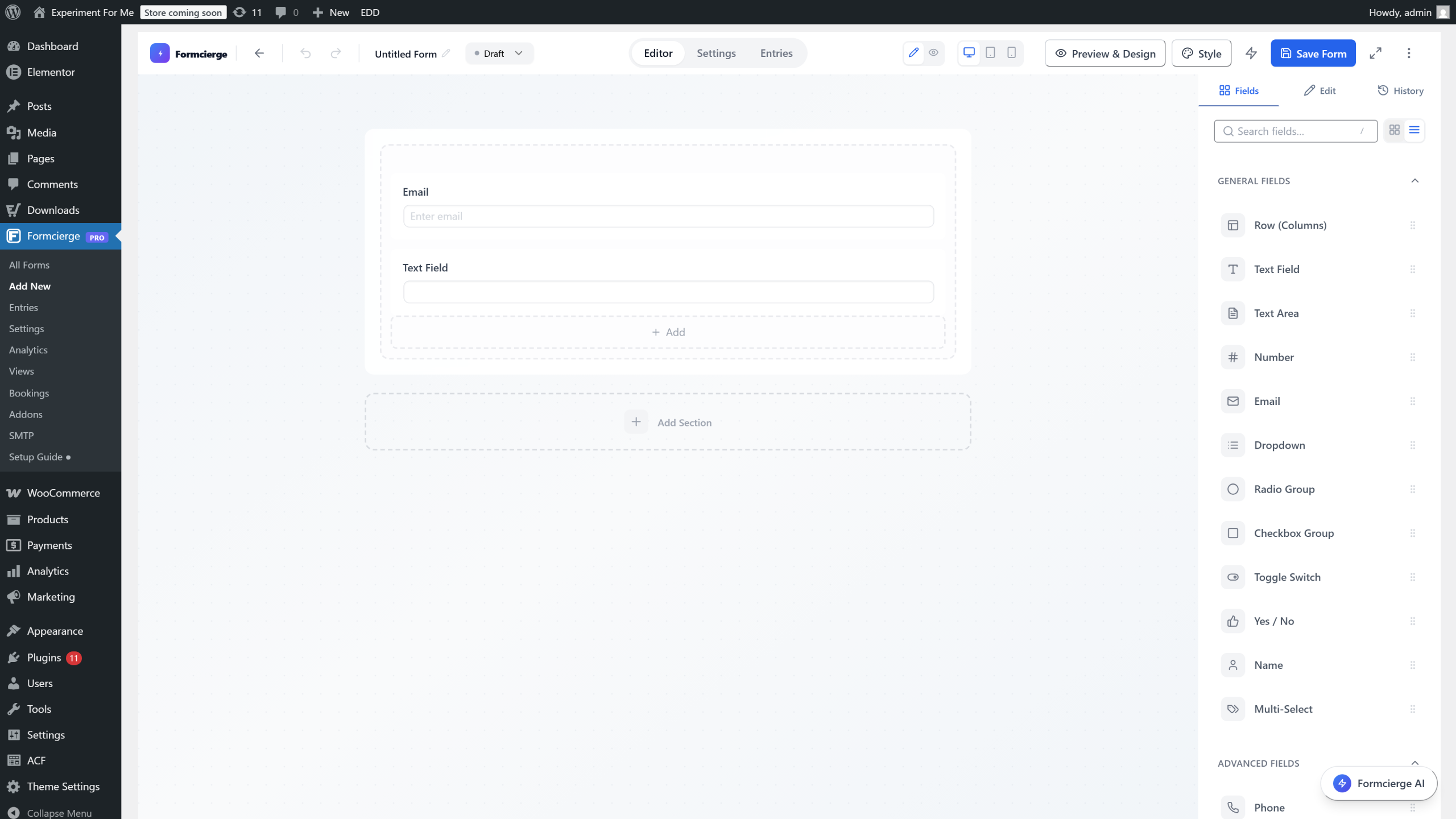
The form builder is divided into four areas: a **top bar** across the top with global actions, a **left panel** on the left with field types and style controls, a **canvas** in the centre where you drag and arrange fields, and a **right panel** on the right where you configure the selected field. Every form you build lives entirely within this interface.

At the very top-left of the top bar is the **form name** field — it starts as *Untitled Form*. Click it and type a descriptive name like *Contact Us* or *Booking Request*. This name is used in the Formcierge admin dashboard and in notification emails, but it is **not** shown on the public form unless you add a Heading field manually.

The right side of the top bar contains three important controls: a **Preview** button (opens a live form preview in a new tab), a **Save Form** button (saves all your changes), and a **Settings** button (opens the form settings modal). There is also a **Tools** dropdown for actions like copying the shortcode or exporting the form.
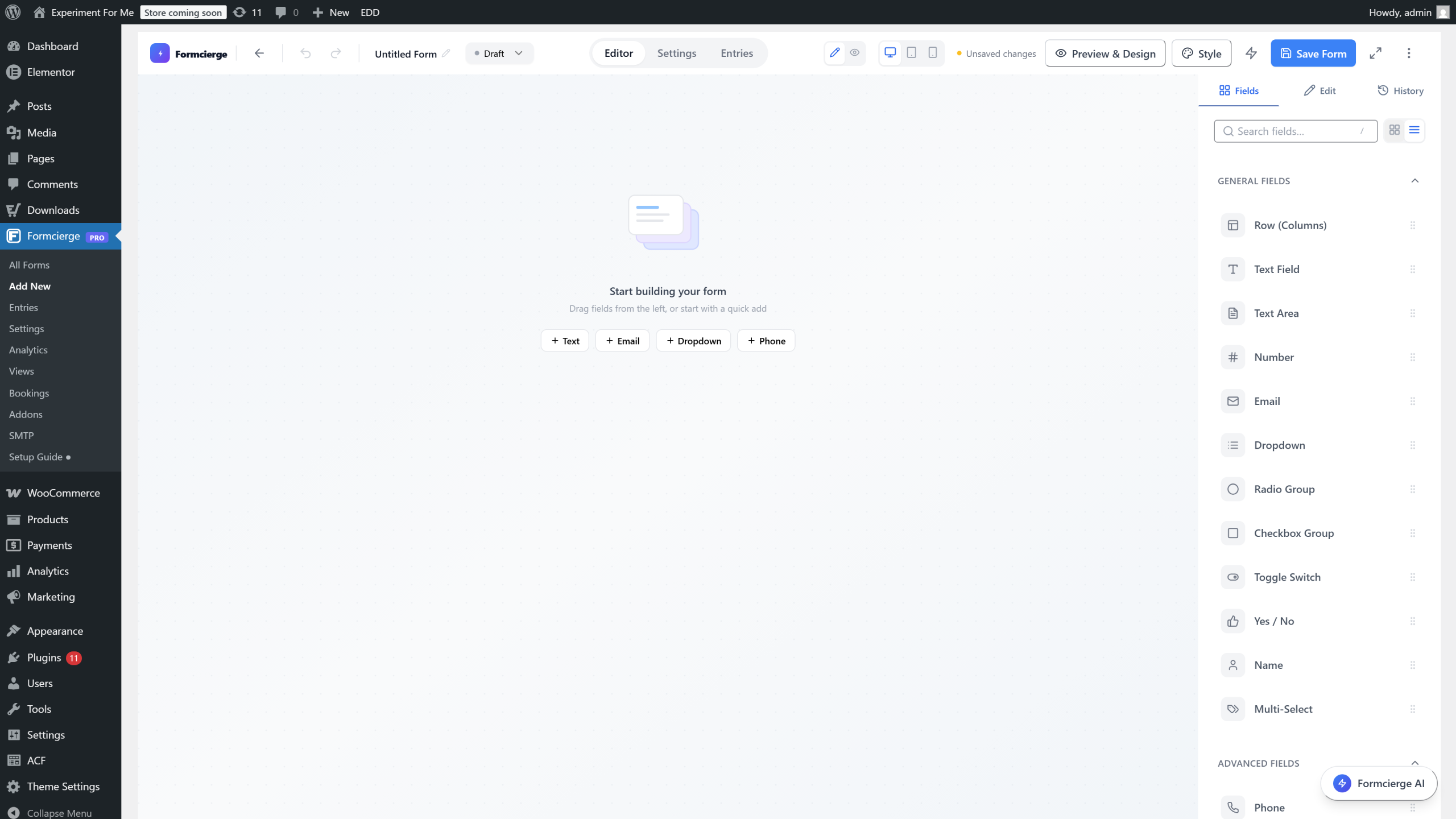
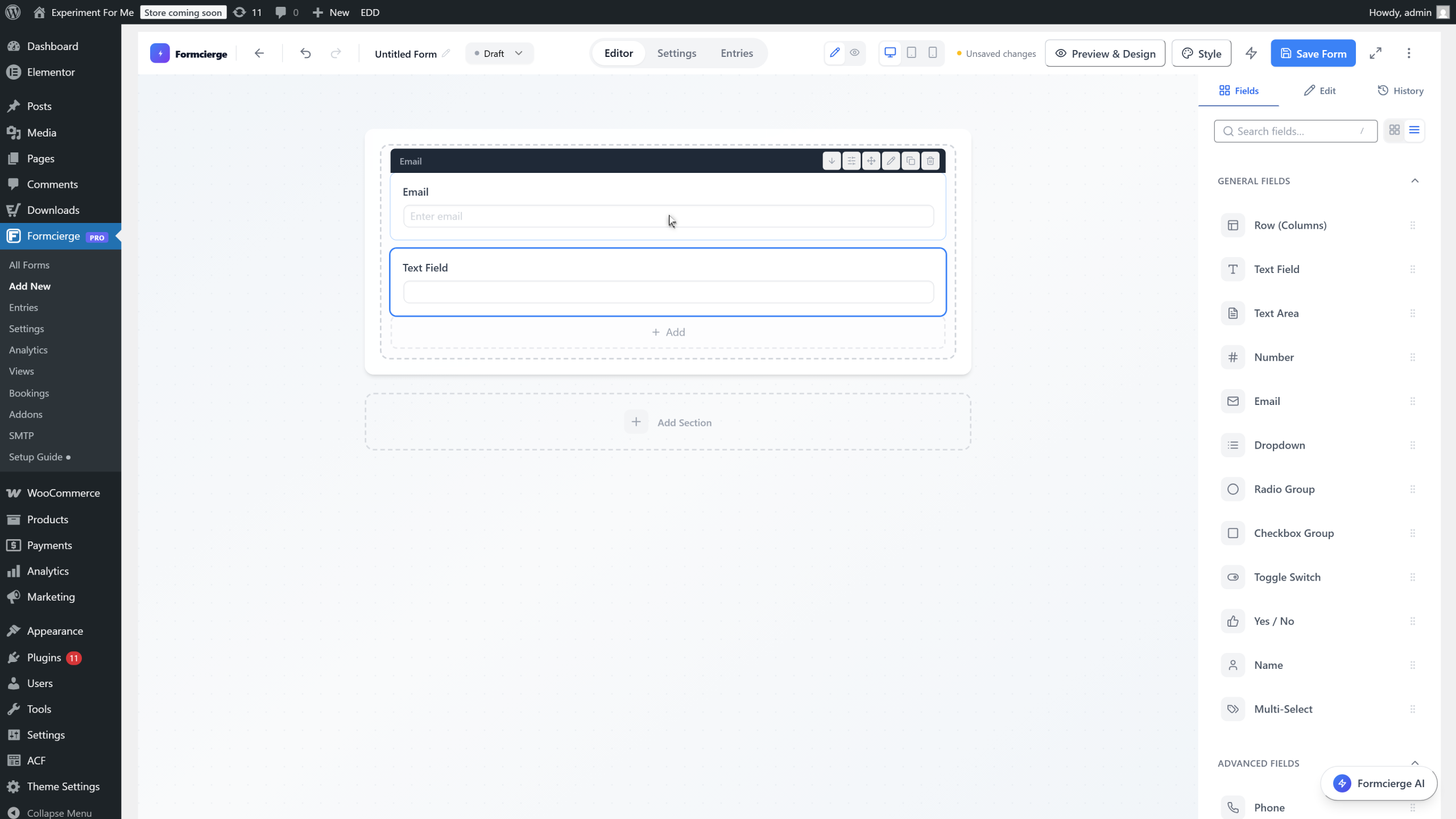
The left panel defaults to the **Fields** tab, which is your field library. Fields are grouped into categories: *General* (text, email, number, etc.), *Advanced* (date, file, rating, etc.), *Layout* (headings, dividers, rows), and *Specialized* (hidden, consent, signature). Scroll down to see all available field types. To add a field to your form, drag it from this palette onto the canvas.

Drag the **Text Field** from the left panel's *General* group onto the canvas. Watch how the canvas highlights the drop zone as you drag — this visual guide shows exactly where the field will land. Release the mouse button to place it.

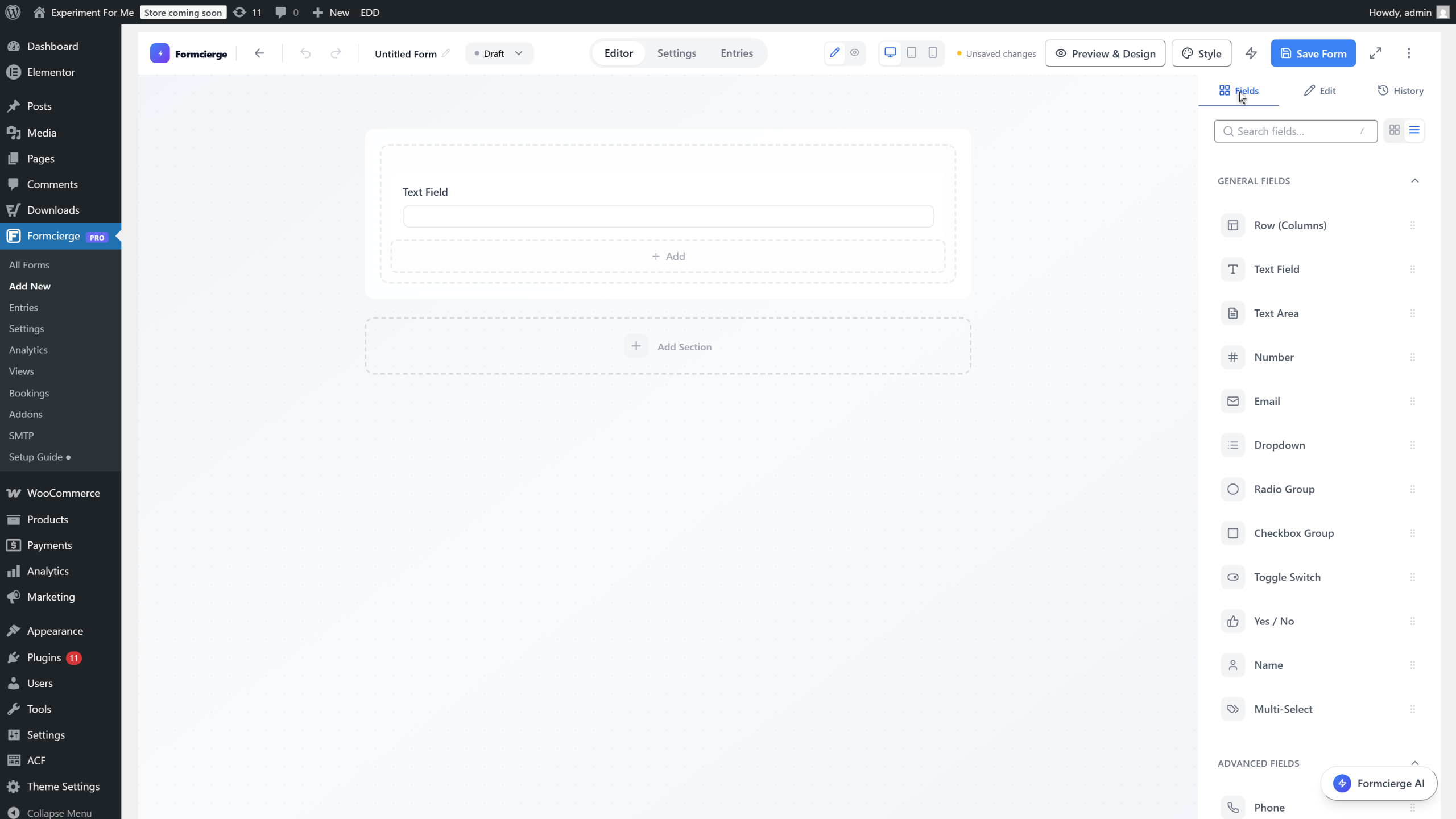
Above the field list, the left panel has two tabs: **Fields** (the field library you see now) and **Settings** (global form styles). Click the **Settings** tab to switch to the **Global Styles** view — choose a colour theme, set the font family, adjust border radius, button style, and more. Changes here affect every field on the form at once.
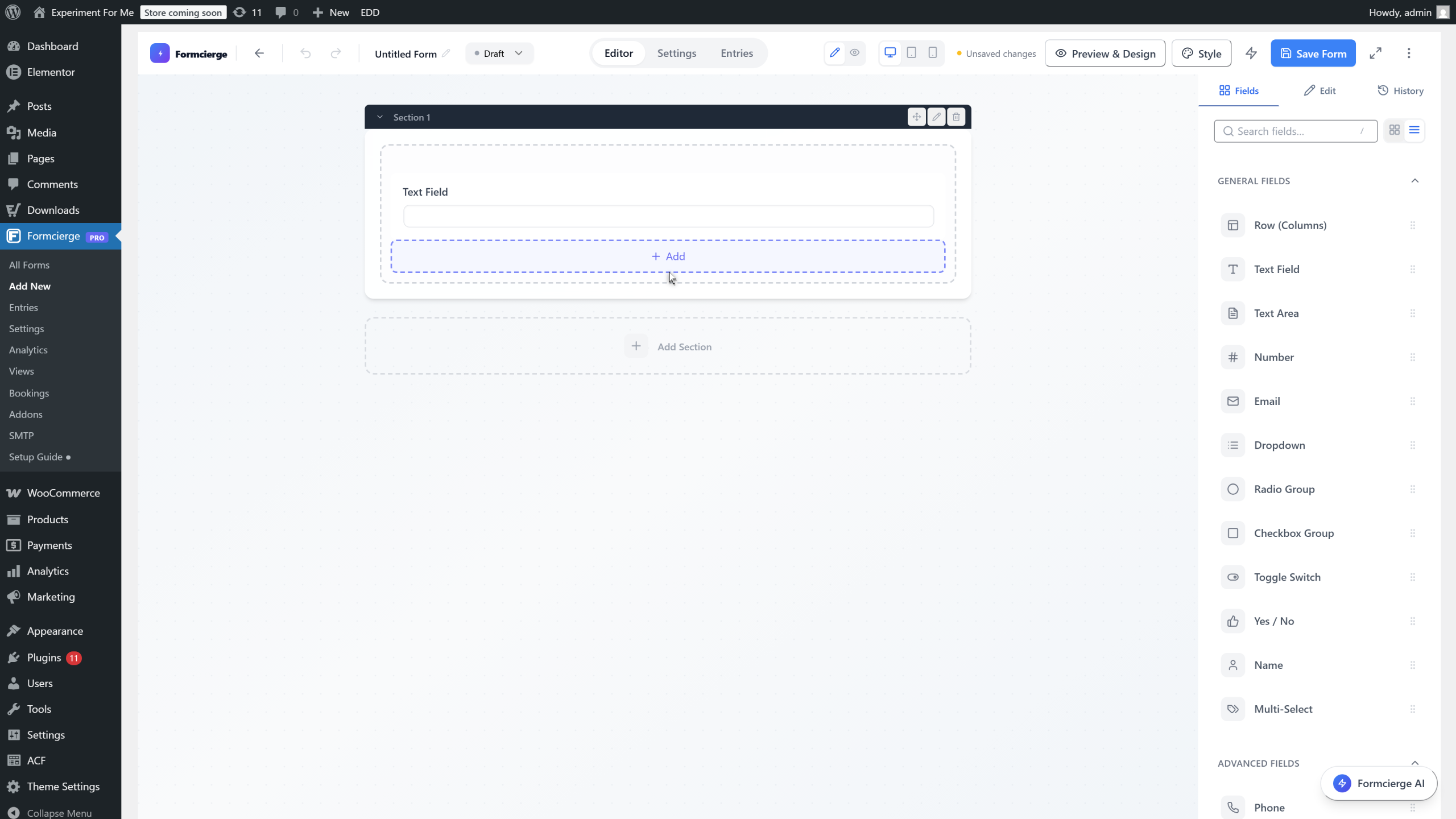
Switch back to the **Fields** tab. The canvas represents the published form exactly as visitors will see it. Every form starts with one **section** (a full-width block). Sections can contain **columns** side by side — useful for multi-column layouts. You can add more sections and arrange fields by dragging them between positions.
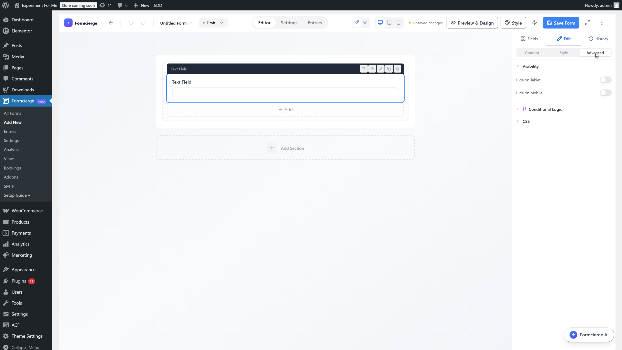
Click the **Text Field** you added to the canvas. The right panel immediately switches to show that field's settings. At the top you will see two tabs: **General** (label, placeholder, required, help text) and **Advanced** (field ID, CSS class, conditional logic, and more). Most everyday edits happen in the General tab.
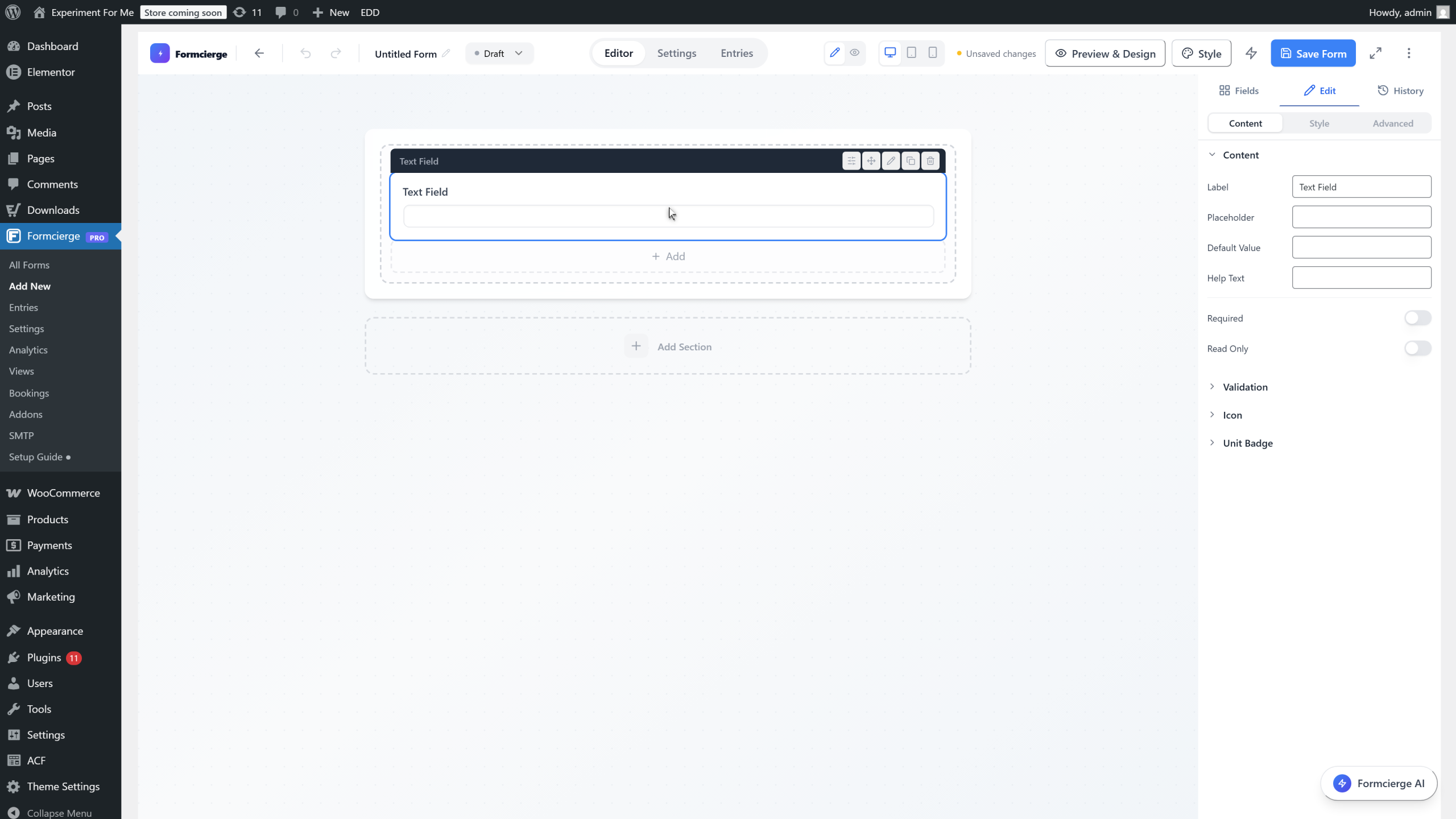
The **General** tab contains the settings you use most often: **Label** (the heading shown above the field), **Placeholder** (the hint shown inside the field before typing), **Help Text** (a small note below the field), and the **Required** toggle (prevents submission if the field is left empty). Edit any of these — the canvas updates live.

Click the **Advanced** tab in the right panel. This contains lower-level settings: **Field ID** (the unique key used in form submissions and API responses), **CSS Class** (add custom classes for targeted styling), **Conditional Logic** (show or hide this field based on another field's value), and **Validation** options. You will not need these settings for basic forms.
Go back to the **Fields** tab and add an **Email** field by dragging it onto the canvas below the text field. Notice that each new field appears below the previous one by default — fields stack vertically. You can reorder them by dragging their handle (the ⠿ icon on the left of each field).
Click **Settings** in the top bar to open the **Form Settings** modal. This is separate from the individual field settings. Here you configure everything that applies to the form as a whole, organised into tabs: **General** (form ID and shortcode), **Submissions** (who can submit and how many times), **Notifications** (email alerts), **Thank You** (confirmation message or redirect), **Security** (CAPTCHA, honeypot), and many more.
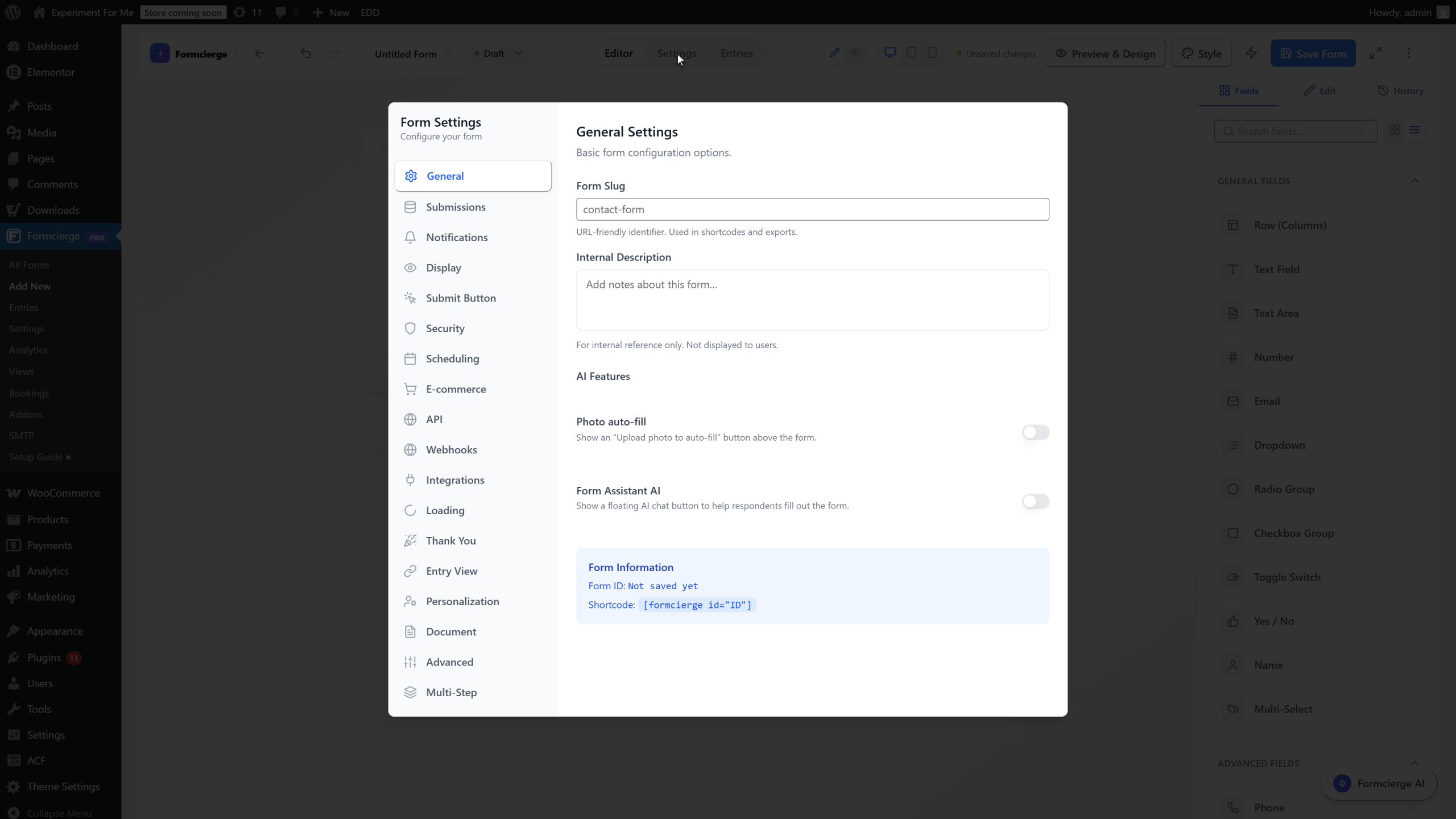
Click the **General** tab in the Settings modal. The blue **Form Information** box at the bottom shows two pieces of data: the **Form ID** (a number like 5) and the **Shortcode** (`[formcierge id="5"]`). Every time you need to embed this form on a page or post, you copy and paste this shortcode. Close the modal when you are done exploring.
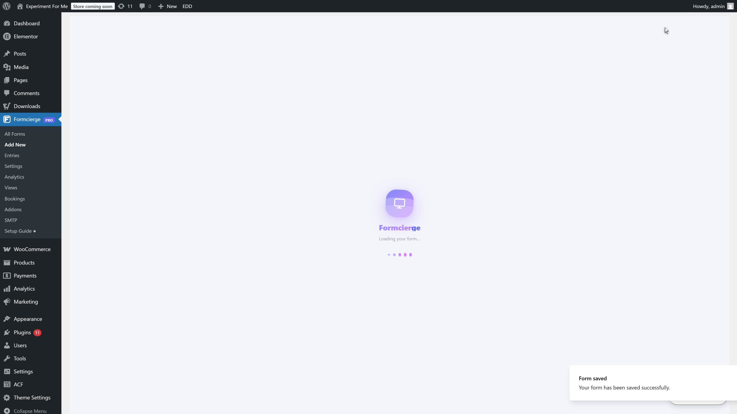
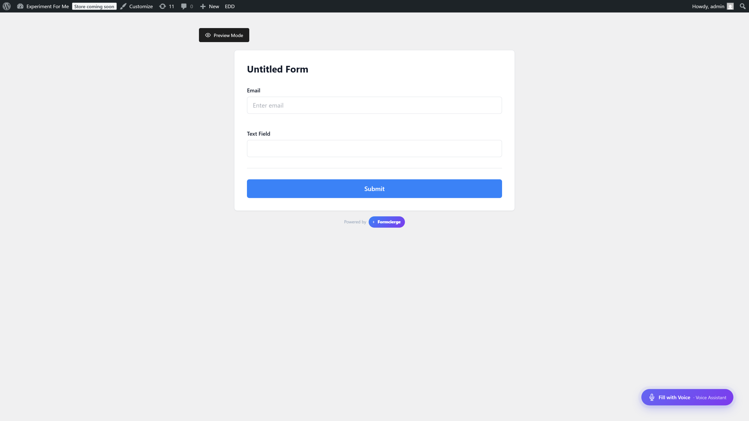
Click **Save Form** in the top bar to save your work. After saving, click **Preview** to open the live form in a clean preview page. The preview shows the form exactly as visitors will experience it — with the correct styling, validation, and submit button. Use this to spot any labelling or layout issues before you embed the form.
The preview page renders your form inside a minimal wrapper so you can focus on the form itself. It shows all field labels, placeholders, any validation messages, and the Submit button. The preview is always up-to-date with the last saved version of your form. Close the tab to return to the builder.
Click **← Back to Builder** at the top of the preview page (or close the tab). You are back in the builder with your form intact. Now that you know every part of the interface, you are ready to build more complex forms using multi-column layouts, conditional logic, and the full range of available field types.
Video Walkthrough
Watch the full step-by-step tutorial